Next Project

Full Time Position as a UX/UI Designer

Pulsenics.com

Redesigning the website for an electrochemical cell monitoring company in order to further reach potential clients and help the general public understand what they do. You can see the completed website at www.Pulsenics.com

The Project

The Pulsenics product is a real time electrochemical control and monitoring system which can extract and understand changing characteristics at the heart of cells operating at high currents. In other words, a window into the invisible operations and consequences of an electrochemical cell. It was my job as a UX project lead to help potential clients understand the Pulsenics product at first glance through well structured, user experience focused web design.

Final Design

Easy to understand subscripton packages accessible through your television.

The Problem

The current website has great visuals and a strong branding, however the user flows are not customer centric and value propositions get lost in the large sums of specific information. It was my responsibility to rethink the user flow and simplify the information so it could be easily understood by the general public while providing value propositions to potential clients in the electrochemical industry.
I was required to design a responsive mobile friendly website using UX best practices and provide a final functional site using Webflow.

The Goal

Create user flows in order to find potential clients and get them to contact the Pulsenics team.
Redesign the information architecture of the Pulsenics website to meet business goals.
Design a human centered web design following UX best practices.
Provide clarity regarding the Pulsenics products to potential clients.
Create a fully functional website for all devices while integrating modern functionality.

Research

Current User Flow Audits

•The current site was audited in order to build an understanding of what is working and what is not in order to provide the best client experience.

Competitor Analysis

• Our team extensively researched competitor and like Industry sites in order to gain a better understanding of client expectations and standards.

Current User Flow: Pulsenics.com

The current site is a single landing page. The Pulsenics team was looking to completely restructure the site using best UX practices to help users understand their product. It was my responsibility to Audit the website and all of the resources to determine what could be rethought and incorporated into the new site.
Plan of action based on our initial evaluation:
Step 1 is re-positioning the Pulsenics website to be use case and industry focused. We need to tell a story of the product and how it improves the work flow for our clients.

Step 2 is to create a product page for hardware, software and the AI, each page providing easy to understand information that paints a full picture of the product.

Step 3 is to create a team page and give a face to the company.

Step 4 is provide easy access to contact information and convince potential clients to further inquire about the Pulsenics product.
User Behavior:
•User gets to landing page and looks for “On Air” for live content or settings that can get them to subscriptions

Problems:
•Nav itself is not versatile and only is accessible from the top. Users at the bottom of the page will need to navigate back up or very bottom to hit the “back to top” button.
•User doesn’t know where subscriptions are accessible

Ideas:
•Making navigation bar more accessible
•Needs indication of subscriptions on landing page
User Behavior:
•User sometimes clicks down or center click to view content for a brief moment
•User continues to click right eventually towards main goal

Problems:
•Navigation is slow due to loading content through multiple sections.

Ideas:
•Navigation should avoid loading the new content while moving through sections in order to make the experience seamless.
User Behavior:
•User gets to landing page and looks for “On Air” for live content or settings that can get them to subscriptions

Problems:
•Nav itself is not versatile and only is accessible from the top. Users at the bottom of the page will need to navigate back up or very bottom to hit the “back to top” button.
•User doesn’t know where subscriptions are accessible

Ideas:
•Making navigation bar more accessible
•Needs indication of subscriptions on landing page
User Behavior:
•User reaches “On Air” section and looks for subscription information
•User decides to try and watch live content airing currently

Problems:
•There is still no information regarding subscriptions or indication to what is available to the user currently.

Ideas:
•Subscription options need to be included in this section.
or
User Behavior:
•Some users will continue to the settings and profile page and look for subscriptions.
•Users eventually click on “Manage Account” as the only related option to subscriptions.

Problems:
•There is no subscription section and the user still doesn't understand how to add them.

Ideas:
•More settings need to be included inside of the android TV app of Crave including subscription management.
Conclusion:
•Both endings to the user flow lead to a non-actionable non-informative page! There is no options to manage subscriptions or add them.
•This is a failure in user experience and business goals.  The user cannot pay for, or access subscriptions and the business goals of obtaining new subscriptions fails.

Current User Flow: Access Subscriptions Web Browser

c

Competitor Analysis

Our team began researching competitors and like products within the industry. This step allowed us to discover what kind of heuristics users could expect when visiting similar sites and in turn the Pulsenics site. We were looking for:
Heuristics for like Industry sites that users come to expect
Clever methods of showing complex information with a clean aesthetic
Methods for explaining value in their product or service
Methods for client outreach
Metrics and how effectively they are used
User flows for showing information across the site and development of product story
How information and products are divided in their respective pages

Competitor Analysis: Axine Water

Axine offers industrial water treatment solutions utilizing electrochemical technology and are one of Pulsenics main competitors. The website user flows are well thought out and Axine does a great job of explaining their process, technology and presenting value propositions in an easy to understand manner.
Streaming Service Subscriptions
% of  subscriptions among participants
• 92% use Netflix which is expected as the most popular and notable streaming service currently.

• 67% use Crave. We are looking to offer additional services (like live TV) in order to turn additional profit from the already strong base of users.

• Apple TV, Prime Video and Disney+ are also prominent services among users. We researched features and UI elements between them
Why do you use streaming services?
% of participants
• Content and exclusive content are the main drivers for customers subscriptions
• 42% of participants also indicated that they would be willing to pay per view events

• 25% are willing to add a small fee to the subscription.

• We used these insights to validate the payment structures that we would be implementing.
Would you pay more for live TV and live events
What live content do you watch?
% of  subscriptions among participants
• Half of the participants have access to cable or satellite and all participants find value in some sort of live content.

• Interest in award shows, live sports, news and late night talk shows are most prominent. We utilized the results to target the right content, for promotion and marketing the live package.
83% of participants wanted access to live on air events
How do you keep informed about upcoming live on air
events or scheduled TV?
% of  participants
• Users discover upcoming events via social media and commercial content from the service.

• New content is discovered browsing through in app categories and recommendations.  

• Crave already has a TV guide style navigation and category style media organization. We can utilize the TV guide in a much more interactive way. Features like "save for later" or "scheduled viewing" could be utilized to bring the classic tv experience into the streaming service in a way that feels natural.

• The ability to schedule live events is an optimal way to get the user the best experience.
How do you find new content to watch within the app?
Per Week, which devices do you stream video from and for how long?
• Users allocate the majority of their time watching content on smart TVs versus Desktop, and mobile. A minority of users are spending 10 to 15 hours per week viewing on desktop and mobile, however we may be able to attribute these to twitch streaming and Youtube content which is outside the project scope.

• We determined that there is enough evidence to allocate resources towards the smart TV Crave application.

Competitor Analysis: De Nora

De Nora is a giant in the energy sector. Their website has a very large amount of information to accommodate the many different applications for their services. We are looking at Denora to understand how they parse their information and lead clients to the appropriate places on the site and get clients to contact the team.

Competitor Analysis: Rockmass Technologies

Rockmass technology is not a direct competitor of Pulsenics, however the site is very successful of showing their physical product which we will have to consider going forwards with the Pulsenics product.

Personas

Based on the research results, we built up two personas to help us focus on ideal user experiences that we wanted to create. We believe that these two personas encompasses not only the new customers we want to attract, but also the girth of existing customers.
Key Characteristics

• Wants to watch exclusive content.
• Always comparing prices but knows good value.
• Needs on demand for access to content wherever he is.
• Doesn’t like traditional TV bundled packages.
Goals

• To watch the latest and greatest content.
• To have access on all his devices.
Frustrations

• Dislikes loading times slow functioning applications.
• Can’t stand cable packaging system
forcing him to pay for content he doesn't want.
• Has trouble finding shows with Netflix search and categorization.

THE 
CONTENT 
HUNTER

Matthew

Gaming Enthusiast
Biochemist Researcher at University of British Columbia, BC

“It’s all about the latest and greatest”
Matthew is a 26 year old Biochemist with a job as a researcher for the University of British Columbia. Matthew lives alone and has surrounded himself with the latest technology. He is always on the move but still finds plenty of time to catch to watch his shows either on the go, in bed with an iPad or on his Android Smart TV. Matthew loves to dive deep into the lore of TV shows and analyzes every detail as he watches.
Key Characteristics

• Wants to watch exclusive content.
• Loves Blockbusters on HBO
• Wants to continue using traditional service provider
• Supports Canadian businesses
• Likes the retro system of TV guides but is looking for a modern approach
Goals

• Needs minimal decision making and options when finding content
• Likes suggestions and exploration of new content
• Wants access to streaming service features
• Needs sports and news readily available
Frustrations

• Doesn’t know what to watch sometimes
• Poor at making timely decisions
• Doesn’t want multiple streaming apps for different content
Dustin is a 35 year old  technology teacher who lives in the Leslieville area. He has a wife and two small children 3 and 6. Dustin is an accomplished teacher and a track and field coach for the high school he works at with multiple team awards under his belt. He has been working for 6 years and is making a good salary. Dustin spends his free time on personal design projects and watching TV with the family. He loves to work at home with the TV on as background noise.

Dustin

High School Teacher
Toronto District School Board, ON

“Life is about experiences and enjoying it all in stride”

THE 
NEW
OLD
SCHOOL

Information Architecture

By creating an information architecture, we created a blueprint for the site structure. Our team reached a concessive plan for the site through our research phase combined with a focus on the Pulsenics business goals. Our main focus for the site is to build intrigue on the landing, while also explaining the process in an easy to understand way with the options to explore information further. The main user flow is from landing page moving directly the the contact page. This would allow Pulsenics to follow leads immediately and get into live demos.

Sketching

Moving into rapid sketching and ideation, the goal of this exercise was to nail down MVPs for the site as well as the best user flows in order to achieve business and user goals. As a team, we focused on the main user flow and getting potential clients the appropriate information and guide them to the CTAs in order to contact Pulsenics.
Landing Page Sketches

Wireframing

After the sketching phase, our team moved into wirefraing. Our team moved through three versions in order to reach the final UI.

Our mission was:

Create a landing page that could explain the Pulsenics product at first glance and lead users to our contact page
Design a products page that shows product offerings and differentiations. CTAs to bring user to desired flows
Create a software and AI page to further explain the technology and value behind the product
Develop a case study page to show the applications and value-add for potential clients
Give a face to the company through a company about page while prompting contact from potential clients.

Wireframing: Landing Page

Based on the Pulsenics business goals and our goals for the user, we developed the landing page as an informative site map. We want the user to know and understand the product as soon as possible. It is niche and difficult to explain without diving into examples and explanations. It was my goal as a UX designer to guide the user through understanding the Pulsenics product and value at a glance, while also providing routes to find more information and act upon it.

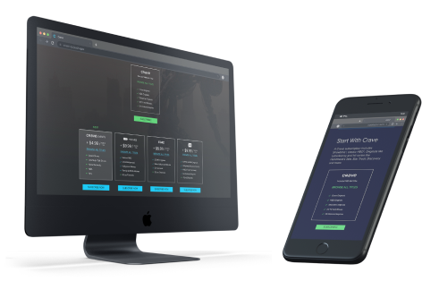
Wireframing: Hardware Product Page

The hardware page is a key checkpoint in the user journey. Pulsenics needed this page to help differentiate product offerings and help clients understand what the Pulse series hardware does. Our goals included: incorporating a section for hardware options with CTAs, and providing user flows towards the software product page.

Wireframing: Software/AI

We decided on a page dedicated to both the software and the AI since Pulsenics would like users to see them as synonymous. The major problem that we had to work with during this process was that the software interface was not yet designed. The system software would become a secondary task alongside designing the software site page. We needed to include at the very least the aesthetic of the software dashboard in order to make the software web page work as intended.

Wireframing: Case Studies

My goal for the case studies page was to give the guest an opportunity to visualize how the Pulsenics product could be applicable for their own operations. We needed to design a step by step process to create a user flow through the page outlining the value add from the product and help the user visualize utilizing the Pulsenics product within the results.

Wireframing: About Us

We decided on a page dedicated to both the software and the AI since Pulsenics would like users to see them as synonymous. The major problem that we had to work with during this process was that the software interface was not yet designed. The system software would become a secondary task alongside designing the software site page. We needed to include at the very least the aesthetic of the software dashboard in order to make the software web page work as intended.

Wireframing: Contact Page

Contact page needed to be simple but specific so that the Pulsenics team could make contact with potential clients. Currently the main method of sales pitch is for the team to make contact and arrange demos.

Second Iteration

Third Iteration

Final UI

After 4 design sprints, we finally came to our final interface for each page and simultaneously built it using Webflow. The site is fully responsive and also has been designed for mobile. You can see the full site at www.Pulsenics.com
Web
Mobile

Results

As this project came to a close, I believe we have exceeding client expectations. We were successful in implimenting almost all business goals while maintaining good user experience across the resposive site. We successfuly:
Created a user friendly landing page that met all business goals and provided paths for guests to immerse themselves in the Pulsenics product and technology
Successfully promoted the products while while providing valuable information and propositions
Provided value through examples, applications, case studies and information
Created a company aesthetic and built an entire design system for Pulsenics to use moving forward through their design iterations
Utilized Webflow to create a responsive, mobile friendly site.

Debriefing

During this project, I had the opportunity to work with a variety of people within my team. I was in direct communication with every member and all three owners through the entire process, developing the idea with the front end team, back end team and management

Skills

UX Design
Design System
Web building
Motion Design

Team

Myself
1 Junior Designer
1 Software Engineer
CEO
CTO
CFO

My Responsibilities

Working with another junior designer as well as all members of the Pulsenics team in order to create a responsive website based in User Experience

Softwares

Figma
Photoshop
Illustrator
Webflow
After Effects
Premiere
Zeplin

200

Hours

250

Cups of Coffee
See more of my UX work