Next Project

Freelance Work as a UX Designer

EastStreetSandwiches.com

Redesigning the website for a family run traditional Italian Sandwich restaurant and promote their product while providing call to actions and researched user flows helping customers find what to eat and how to get it.

The Project

East Street Italian Sandwiches is a family owned and run restaurant in North York, ON with authentic generational recipes. Vince and Antonette, the owners were looking to develop their outdated website and drive more online traffic in the wake of the Covid-19 crisis. Vince being in a business park relies on small and large business lunch crowds for the majority of his regular business. Since March 2020, the entire park has been closed with all of the lunch crowd working from home. Vince found himself in dire straights without a consistent source of business and realized that he needed to lean more heavily on food ordering apps and pick up orders to adapt.
Final Design
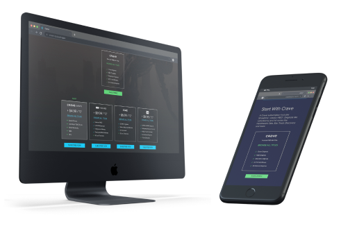
Easy to understand subscripton packages accessible through your television.

The Problem

The restaurant business is losing money in the wake of Covid-19. Vince from East street sandwiches approached me in order to help redesign their current website in order to drive more traffic and guide users towards their various ordering options. How might we provide better user flows so guests can review menu options and navigate their way to ordering as efficiently as possible.

Hypothesis
By providing immediate order options and easy to navigate menus on mobile and web for hungry guests, we will increase conversion rates and sales. We will know this to be true by seeing a greater website presence and order quantities.

PROJECT GOALS

Create a responsive and mobile friendly site.
Create flows through the website and provide call to actions for ordering
Use website best practices to rank higher in google searches
Create an easy to understand menu that the owners can add and subtract from
Migrate site to google cloud platform

Research

My research consisted of a competitor analysis and google analytics evaluation. I was looking to find out what users come to expect from similar restaurants and find out how the current site has failed the business goals and users.

Current User Flow Audits

•The current site was audited in order to build an understanding of what is working and what is not in order to provide the best client experience.

Competitor Analysis

• Our team extensively researched competitor and like Industry sites in order to gain a better understanding of client expectations and standards.

Google Analytics Insights

• Utilizing data and insights through google analytics in order to understand how users were accessing the site and where the current pain points were

CurrentWebsite: User Flow Audit

The current site is a single page + links to the catering menu and social media. Upon further inspection, I found that all text inputs are headers which is severely impacting the findability from google searches. It currently lacks links to the three other food ordering apps that East Street Sandwiches has signed up for. Users are likely coming to this page to view the menu, but lacking options to order. I was looking to restructure the entire site with multiple pages in order to break apart information and provide space to display more information in their respective places. The current site doesn’t tell a story of the business and users cannot be expected to understand what they are getting from the current information.
Plan of action based on our initial evaluation:
The current site clearly needs an update in order to better deliver information to guests. We need to look to splitting up information and guiding users along a path to ordering form their preferred ordering apps or methods. Additionally, we need to give a face to East Street Sandwiches and help users familiarize themselves with the restaurant, it’s food and it’s vision. East Street Sandwiches provides a family run, authentic and fresh Italian eating experience and we need to purvey this information to their guests.
User Behavior:
•User gets to landing page and looks for “On Air” for live content or settings that can get them to subscriptions

Problems:
•Nav itself is not versatile and only is accessible from the top. Users at the bottom of the page will need to navigate back up or very bottom to hit the “back to top” button.
•User doesn’t know where subscriptions are accessible

Ideas:
•Making navigation bar more accessible
•Needs indication of subscriptions on landing page
User Behavior:
•User sometimes clicks down or center click to view content for a brief moment
•User continues to click right eventually towards main goal

Problems:
•Navigation is slow due to loading content through multiple sections.

Ideas:
•Navigation should avoid loading the new content while moving through sections in order to make the experience seamless.
User Behavior:
•User gets to landing page and looks for “On Air” for live content or settings that can get them to subscriptions

Problems:
•Nav itself is not versatile and only is accessible from the top. Users at the bottom of the page will need to navigate back up or very bottom to hit the “back to top” button.
•User doesn’t know where subscriptions are accessible

Ideas:
•Making navigation bar more accessible
•Needs indication of subscriptions on landing page
User Behavior:
•User reaches “On Air” section and looks for subscription information
•User decides to try and watch live content airing currently

Problems:
•There is still no information regarding subscriptions or indication to what is available to the user currently.

Ideas:
•Subscription options need to be included in this section.
or
User Behavior:
•Some users will continue to the settings and profile page and look for subscriptions.
•Users eventually click on “Manage Account” as the only related option to subscriptions.

Problems:
•There is no subscription section and the user still doesn't understand how to add them.

Ideas:
•More settings need to be included inside of the android TV app of Crave including subscription management.
Conclusion:
•Both endings to the user flow lead to a non-actionable non-informative page! There is no options to manage subscriptions or add them.
•This is a failure in user experience and business goals.  The user cannot pay for, or access subscriptions and the business goals of obtaining new subscriptions fails.

Current User Flow: Access Subscriptions Web Browser

c

Competitor Analysis

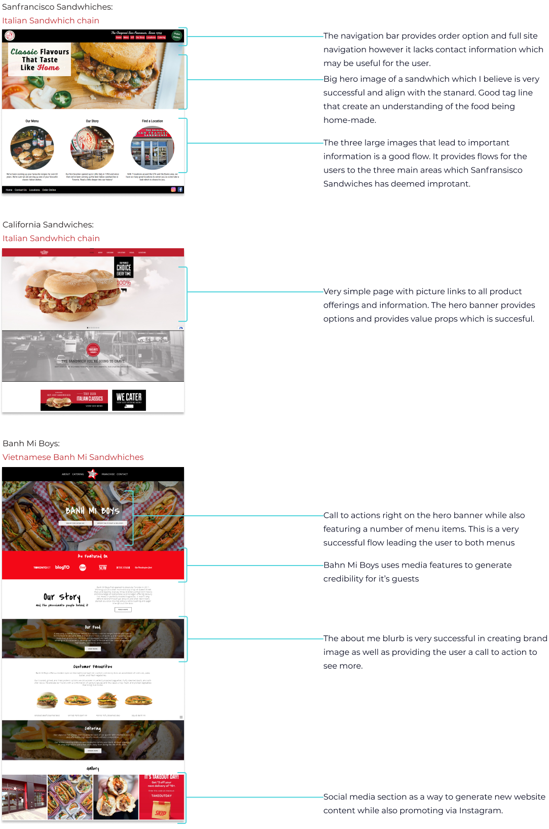
We began by looking at competitors in order to pinpoint areas of improvement and innovation without repeating similar mistakes. We looked at direct competitors who are also offering Italian style sandwiches as well as secondary competitors who offer offer platter and sandwich style products. Some things we were looking for, through the competitive analysis include:
How similar companies present their initial landing pages
What is the most pertenant information and flows through the website
Where do they place their call to actions for ordering
How do they organize the information on the site and parse menus

Competitor Analysis: Landing Page

I went through the process of  first exploring different landing pages in order to find successful user flows and methods for introducing information.
Streaming Service Subscriptions
% of  subscriptions among participants
• 92% use Netflix which is expected as the most popular and notable streaming service currently.

• 67% use Crave. We are looking to offer additional services (like live TV) in order to turn additional profit from the already strong base of users.

• Apple TV, Prime Video and Disney+ are also prominent services among users. We researched features and UI elements between them
Why do you use streaming services?
% of participants
• Content and exclusive content are the main drivers for customers subscriptions
• 42% of participants also indicated that they would be willing to pay per view events

• 25% are willing to add a small fee to the subscription.

• We used these insights to validate the payment structures that we would be implementing.
Would you pay more for live TV and live events
What live content do you watch?
% of  subscriptions among participants
• Half of the participants have access to cable or satellite and all participants find value in some sort of live content.

• Interest in award shows, live sports, news and late night talk shows are most prominent. We utilized the results to target the right content, for promotion and marketing the live package.
83% of participants wanted access to live on air events
How do you keep informed about upcoming live on air
events or scheduled TV?
% of  participants
• Users discover upcoming events via social media and commercial content from the service.

• New content is discovered browsing through in app categories and recommendations.  

• Crave already has a TV guide style navigation and category style media organization. We can utilize the TV guide in a much more interactive way. Features like "save for later" or "scheduled viewing" could be utilized to bring the classic tv experience into the streaming service in a way that feels natural.

• The ability to schedule live events is an optimal way to get the user the best experience.
How do you find new content to watch within the app?
Per Week, which devices do you stream video from and for how long?
• Users allocate the majority of their time watching content on smart TVs versus Desktop, and mobile. A minority of users are spending 10 to 15 hours per week viewing on desktop and mobile, however we may be able to attribute these to twitch streaming and Youtube content which is outside the project scope.

• We determined that there is enough evidence to allocate resources towards the smart TV Crave application.

Competitor Analysis: Menu Page

The menu is the most important page on the website. I was looking to competitors to see how they organized their different foods as well as toppings. The user needs to be able to navigate through the menu and make decisions while balancing cost in their head. I was looking for features and ideas that made this process easy and successful.

Competitor Analysis: Catering Page

Catering is a big part of the East Street Sandwiches business model and looking into other site catering pages will help me determine what kind of systems can be used to make this process easily accessible. For version one of the new website, we will not be implimenting an online ordering system and therefore we will be looking at ways to access information and make decisions based on that information.
In Reflection
Competitors have robust websites with well organized menus and landing pages. Most user flows begin with a large image and lead into desired user goals seemlessly and as expected. Nothing is hidden within menus and features and all items are shown with pictures one way or another.
Key Characteristics

• Wants to watch exclusive content.
• Always comparing prices but knows good value.
• Needs on demand for access to content wherever he is.
• Doesn’t like traditional TV bundled packages.
Goals

• To watch the latest and greatest content.
• To have access on all his devices.
Frustrations

• Dislikes loading times slow functioning applications.
• Can’t stand cable packaging system
forcing him to pay for content he doesn't want.
• Has trouble finding shows with Netflix search and categorization.

THE 
CONTENT 
HUNTER

Matthew

Gaming Enthusiast
Biochemist Researcher at University of British Columbia, BC

“It’s all about the latest and greatest”
Matthew is a 26 year old Biochemist with a job as a researcher for the University of British Columbia. Matthew lives alone and has surrounded himself with the latest technology. He is always on the move but still finds plenty of time to catch to watch his shows either on the go, in bed with an iPad or on his Android Smart TV. Matthew loves to dive deep into the lore of TV shows and analyzes every detail as he watches.
Key Characteristics

• Wants to watch exclusive content.
• Loves Blockbusters on HBO
• Wants to continue using traditional service provider
• Supports Canadian businesses
• Likes the retro system of TV guides but is looking for a modern approach
Goals

• Needs minimal decision making and options when finding content
• Likes suggestions and exploration of new content
• Wants access to streaming service features
• Needs sports and news readily available
Frustrations

• Doesn’t know what to watch sometimes
• Poor at making timely decisions
• Doesn’t want multiple streaming apps for different content
Dustin is a 35 year old  technology teacher who lives in the Leslieville area. He has a wife and two small children 3 and 6. Dustin is an accomplished teacher and a track and field coach for the high school he works at with multiple team awards under his belt. He has been working for 6 years and is making a good salary. Dustin spends his free time on personal design projects and watching TV with the family. He loves to work at home with the TV on as background noise.

Dustin

High School Teacher
Toronto District School Board, ON

“Life is about experiences and enjoying it all in stride”

THE 
NEW
OLD
SCHOOL

Google Analytics

I was curious to look into the site analytics in order to determine areas of improvement and typical browsing patterns from the East Street Sandwiches users. I utilized my findings in order to show the need for a mobile + a responsive website and decide on  screen sizes to be prioritizing while designing. I additionally wanted to understand how guests accessed or found the current website. This would help further into the design process for site structure and SEO.
Session Medium
Based on the session medium summary, I can determine that 64% of guests are searching for East Street Sandwiches through google searches, while 24% are using bookmarks or direct searches into their browsers. In order to best utilize this information, I will need to optimize the existing site SEO for searchability through google. The current site structure and text are not optimized for search engines and therefore becomes a possible missed opportunity to further the restaurant's clientele.
User Devices
A majority 63% of users access the website through mobile, making the mobile site the top priority. The current site is not mobile friendly and becomes hard to read with screens smaller than desktop.
Screen Resolution
Average screen resolution will help give a base for wireframing. I will be designing for web first at 1920px and mobile first at 375px.
In Reflection
Using the google analytics insights, I was able to plan for the website structure by understanding what devices and screen sizes guests are most likely to access the site with. Additionally, I determined probable cause for restructuring based on how users find the site. By improving SEO, we can in turn produce more viewership and sales.

Sketching

I wanted to rapid sketch through multiple concepts and simple layouts for each individual page. By doing this exercise I was able to quickly relay ideas and get approval from the owner for proceeding forward on the design work.
Landing Page Sketches
While exploring different landing page concepts I was looking to find solutions for providing absolutely necessary information and call to actions, while also giving an aesthetic to the restaurant site. I needed users to be able to act immediately on user goals while also providing a good CX across the entire site. Ordering apps needed to be at a high level but also not detract from the authenticity of the small Italian sandwich shop feel.
As ideation was narrowed down, we decided on a layout which would showcase large original images while also providing immediate CTA's to the most important parts of the site, (the menu and contact information). We utilized the banner to generate excitement and interest with a Hero image and also provide a user flow to ordering.
Menu Page Sketches
While sketching through menu page variations, I wanted to capture the most simple way to get information to guests. This was an important page to nail down since most guests come to the site looking for the menu. I explored various methods for displaying information and pictures while maintaining sections for organization and usability.
Ultimately, I decided to utilize a uniform organization across the menu. Sections are separated by titles with menu items and pricing on the left side. Each section is accompanied with pictures for the best selling items to give guests an idea of what they are receiving.
Catering Page Sketches
Catering is a large part of the East street sandwiches business and I needed to make the page easy to understand and follow along for ordering. Since there was not a plan for an online system in V1 of the site, the iterations were focused on providing step by step ordering processes to follow along.
A centered step by step page was used to lay out the catering page. Each section is separated with headers and all options available were made to be easily understood as they tied into their respective dish options.
About Us Page Sketches
I sketched the About Page around the hero image being the first visual the user sees. I wanted to use a shot of the restaurant and the owner at the highest level of the page along side it's origin story. This would help give a face to the company as well as help users feel comfortable with ordering or visiting. Giving the user context to the ownership will help build rapport.
A simple layout was decided on with a hero image and origin story. Users can take a very short amount of time on this page to help them understand what kind of business East Street Sandwiches is.
Contact and Location Page Sketches
We needed the location page to deliver important information including location, hours of operation and ordering apps in a way that users are familiar with and have come to expect from restaurant sites.
Using a common location page would allow for simple user flows for guests who already understand the format from common heuristics.

Wireframing

I conducted a wireframing phase lasting a few days with consistent feedback from the owners in order to fully realize the site concept. We created 3 versions with the final version being deployed to google cloud services. My goals was to quickly find solutions and iterate on user flows to create the best possible client experience.

Wireframing: Landing Page

Created the structure for the landing based on final sketches.
At first I looked at positioning food ordering apps just below the banner in order to provide quick access to user goals of ordering food.
After a short user testing phase, we found that users had no problem finding the ordering options when placed close to the bottom and  about half of users expected them to be there anyways due to it's commonality from other sites.

Wireframing: Menu Page

Created the basic structure for the menu page aligning all pricing and menu items to the left with images to the right.
After version 1 was finalized, pictures and colour were added to help the owner visualize the final product.
We decided to include all toppings on the top part of the page and increase the amount of visuals so that guests could better understand what food they were ordering.

Wireframing: Catering Page

Since we were not using an online ordering form, we needed to structure this page in a way that was easy to follow like a list. This way the user could go section to section while on the phone with the owner placing the order. By creating a vertical list including topping options, we believed it would create best best use case.
For the final versions, I created a hierarchy of text and section breaks in order to make the catering menu easy to follow. Once this was complete I matched the asthetic with the rest of the site.

Wireframing: About Us Page

I wanted to keep this page familiar to guests and structure it like they would expect from similar sites.
Hero image added as well as spaces for type.
Origin story was added and a day in the life of in order to further push the point that this is a fresh home made brick and morter business.

Wireframing: Location Page

All information was kept close together and in one view port in order to provide the best access to information.
All information was filled including hours of operation, embedded map, written address, phone, and ordering apps.
Daily hours were separated so that they could be changed specifically if needed based on owner feedback.

Second Iteration

Third Iteration

Final UI

After 3 versions of wireframes and approval from Vince the owner, we came to our final design. The Wireframes were handed off to the developer and were written using Sublime Text. Finally the code was pasted to a bucket in google cloud services. We created a mobile version alongside the responsive web design.

Desktop Website

Mobile Website

Results

After multiple sketch iterations and three phases of wireframing, I cam to the final design with the blessing of the owner. I successfully, redesigned their entire website and provided a meaningful user experience with East Street's customers at the center of the design. Our key performance indicators based on google analytics indicate that post design changes, Organic views rose 322% and overall viewership more than doubled to 2000+ views for the month. Vince the owner has since reported an increase in sales and visits to the restaurant.

Debriefing

My responsibilities were leading the iterative design process through conception to execution. I worked with one software engineer and collaborated on coding setting up the hosted site on google cloud services.

Skills

UX Design
Design System
Web building
Mobile design

Team

Myself
1 Software Engineer
CEO

My Responsibilities

Working along side a junior dev in order to bring together a cohesive website for a small business owner in order to promote sales.

Softwares

Figma
Photoshop
Illustrator
Sublime Text 3
Google Console
After Effects

90

Hours

84

Cups of Coffee
See more of my UX work